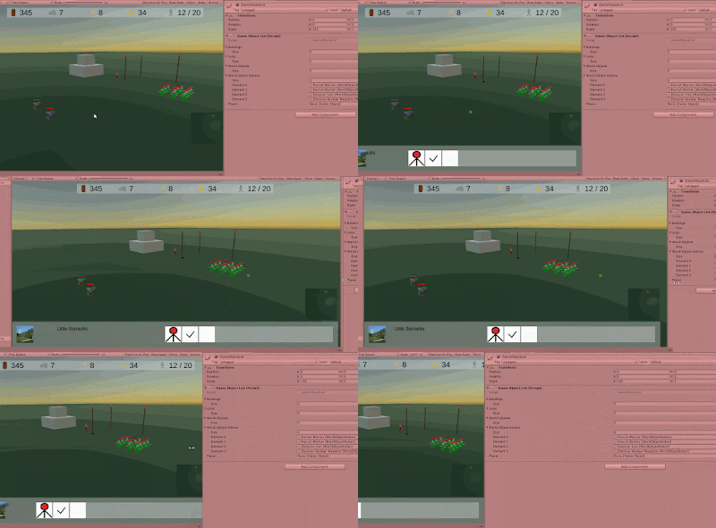
Graphic User Interface or GUI. Can't live without it, can't live with it. Lately I have been working on whatever's going on at the bottom of the screen when objects perform actions. It all works, but it does not look anything near alright.
Now I don't think I should tell anyone that the graphics I am using are placeholder and that does not matter. I could change them whenever I want to. What does get under my skin a bit is the arrangement of the elements on the screen.
The stuff has this position that we know by now... when you look at the animated gifs. Problem is that I'm not releasing an animated gif when I have finished the game. It's supposed to be an actual game. More specific: a pc/mac game.
This means there needs to be thoughts put into layout. What screen size am I supporting? Recently I bought a bigger monitor for my computer and that makes me realize things. When I run Holocene maximized, this is what it looks like right now.
All these identical rounded corners aside, there's so much empty space at the bottom and things are pushed to the side there. It looks - let's face it - very very bad.
Now part of me is talking the placeholder story. I'll have a look when I make the actual graphics. Problem is that that part of me is wrong. It simply is. Can't help it.
I need to have something thought out to make sure everything fits together. Just take a look at the mini map placeholder to the bottom right. It looks out of place while there's enough space to put it.
Then there is this thing when I resize the screen to see that it supports.
The resource bar holds its own quite well and I see no reason to support screens so narrow as to get it in trouble, but the bottom, again, it's ugly. I need to get my pencils out and try something in the next couple of days.


No comments:
Post a Comment